Color theory in film is a subject that plays a more subdued role but is nonetheless an important one. The shades, tones, and palette of a scene can all change the mood, atmosphere, and feeling that a film is emanating. And what better way to analyze color theory in film than to do so through the works of one of today’s most prolific filmmakers, Wes Anderson.
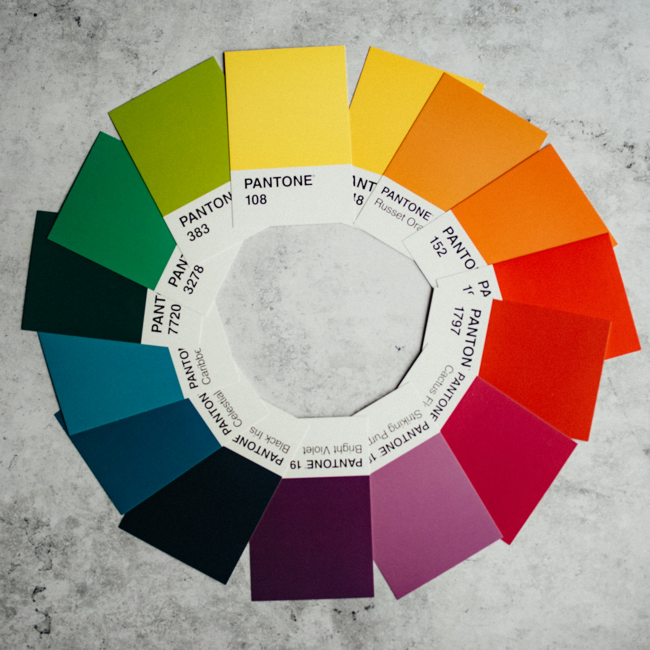
At its essence, color theory encompasses the principles and guidelines that govern the use of color in artistic compositions. It encompasses a myriad of concepts, from the color wheel and complementary colors to contrast and saturation. In the context of filmmaking, color theory serves as a powerful tool for directors and cinematographers to convey mood, evoke emotion, and enhance storytelling.
By understanding the psychological impact of different colors and their symbolic meanings, filmmakers can craft visually captivating narratives that resonate with audiences on a profound level. Keep on reading to learn all about this and more as we examine the ways that Wes Anderson has utilized color in his movies.
Understanding Color Theory in Film
What is Color Theory?
Color theory might sound like a complex concept, but at its heart, it’s simply the study of how colors interact and influence one another. Picture a painter’s palette filled with a spectrum of vibrant hues, each one capable of evoking a different emotion or mood. From the warm embrace of a sunny yellow to the cool tranquility of a deep blue, colors have the power to communicate without uttering a single word. In the world of filmmaking, understanding color theory is like wielding a magic wand, allowing directors to cast spells of enchantment and intrigue upon their audiences.
Role of Color Theory in Film
So, how exactly does color theory come into play in the realm of filmmaking? Well, imagine watching your favorite movie without any color at all. It would be like dining on a feast of flavorless gruel—utterly devoid of vibrancy and life. Colors aren’t just decorative elements in film; they’re essential storytellers, capable of conveying mood, emotion, and meaning with astonishing clarity. Think of the lush green landscapes of a fantasy world or the ominous red glow of a villain’s lair—each color choice is a deliberate brushstroke in the larger canvas of cinematic storytelling.
Importance in Visual Arts and Design
While color theory has deep roots in the world of visual arts and design, its applications extend far beyond the confines of a painter’s studio or a graphic designer’s workstation. In filmmaking, colors serve as silent collaborators, working in tandem with cinematography, set design, and costume choices to create a cohesive visual narrative. Whether it’s the subdued pastels of a romantic comedy or the bold primaries of a superhero epic, color theory influences every frame of a film, shaping the viewer’s experience in profound and subtle ways.
Exploring Wes Anderson’s Style

A Brief Overview of Wes Anderson’s Filmmaking Style
Before we dive into the technicolor wonderland of Wes Anderson’s films, let’s take a moment to appreciate the distinctiveness of his cinematic style. Anderson is renowned for his meticulous attention to detail, whimsical storytelling, and visually striking compositions. His films are like miniature works of art, meticulously crafted with care and precision. From the symmetrical framing of his shots to the carefully curated color palettes, every aspect of Anderson’s filmmaking bears the mark of a true auteur.
Wes Anderson’s Distinctive Use of Color Theory in Film
Nowhere is Wes Anderson’s mastery of color theory in film more evident than in his films. Anderson approaches color with the precision of a painter, using hues and tones to convey emotion, enhance atmosphere, and deepen characterization. Each of his films is a veritable feast for the eyes, with colors that pop off the screen and linger in the mind long after the final frame fades to black. Whether it’s the pastel perfection of “The Grand Budapest Hotel” or the earthy tones of “Moonrise Kingdom,” Anderson’s use of color is as distinctive as his storytelling.
Consistent Palettes Across Films
One of the hallmarks of Wes Anderson’s filmmaking style is his consistent use of color palettes. Anderson is known for meticulously planning every aspect of his films, from the costumes to the set design, and color plays a central role in this process. Each of his films is characterized by a distinct color scheme, with hues that recur throughout the narrative like leitmotifs. This consistency not only lends Anderson’s films a sense of visual cohesion but also serves as a thematic through-line, connecting disparate elements of the story in subtle and profound ways.
Symbolism and Meaning Behind Color Choices
But Anderson’s use of color goes beyond mere aesthetics; it’s imbued with layers of symbolism and meaning. Each color choice in Anderson’s films is carefully considered, with hues that reflect the themes, emotions, and characters of the story. Whether it’s the vibrant reds of “The Royal Tenenbaums” symbolizing passion and rebellion or the serene blues of “The Life Aquatic with Steve Zissou” evoking a sense of melancholy and introspection, Anderson uses color to enrich his narratives and deepen the viewer’s engagement with the story.
Analyzing Color Theory in Wes Anderson’s Films
The Grand Budapest Hotel
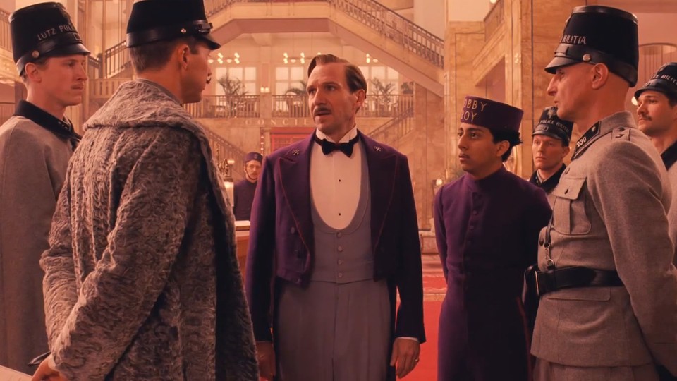
In “The Grand Budapest Hotel,” Wes Anderson’s masterful use of color is on full display, infusing every frame with a sense of whimsy and wonder. The film’s distinctive pastel color palette, reminiscent of a confectionery delight, serves as a visual metaphor for the fantastical world of the Grand Budapest Hotel itself. From the soft pinks and lavenders of the hotel’s façade to the rich golds and blues of its opulent interiors, every color choice in the film is imbued with meaning, evoking a sense of nostalgia and romance that transports viewers to a bygone era of elegance and charm.
Moonrise Kingdom
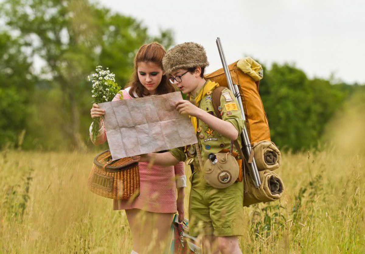
In “Moonrise Kingdom,” Anderson’s use of color is equally striking, albeit in a more subdued and understated manner. Set against the backdrop of a sleepy New England island, the film’s color palette is dominated by earthy tones and muted hues, reflecting the natural beauty of the setting and the quiet melancholy of its characters. Yet, amid the rustic charm of the landscape, bursts of vibrant color—like the bright yellow tents of the Khaki Scouts or the vivid red dress worn by Suzy—serve as beacons of hope and joy, infusing the film with a sense of whimsy and wonder that is quintessentially Anderson.
The Royal Tenenbaums
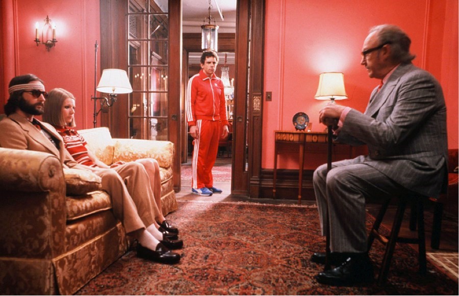
In “The Royal Tenenbaums,” Anderson employs color to underscore the eccentricities of its titular family and the tumultuous dynamics that define their relationships. The film’s color palette is a study in contrasts, with rich jewel tones juxtaposed against muted neutrals to create a sense of visual tension and intrigue. Each character is associated with a specific color scheme—like Margot’s signature camel coat or Richie’s iconic red tracksuit—further deepening their individuality and complexity. Through his use of color, Anderson brings the Tenenbaum family to life in all their flawed, vibrant glory, inviting viewers to empathize with their struggles and triumphs.
Practical Applications of Color Theory in Film

Lessons Learned from Wes Anderson’s Approach
Wes Anderson’s meticulous approach to color theory in film offers valuable lessons for filmmakers seeking to harness the power of chromatic storytelling. One of the key takeaways from Anderson’s work is the importance of intentionality in color selection. Every color choice in Anderson’s films serves a purpose, whether it’s to convey a specific mood, enhance a character’s personality, or reinforce a thematic motif. By approaching color with this level of thoughtfulness and precision, filmmakers can imbue their own projects with depth and nuance.
Importance of Intentionality in Color Selection
Incorporating color theory into the pre-production process can also help filmmakers make more informed decisions about set design, costume choices, and lighting setups. By carefully considering the emotional and psychological impact of different colors, filmmakers can create visual compositions that resonate with audiences on a visceral level. Whether it’s using warm, inviting colors to create a sense of coziness and intimacy or cool, muted tones to evoke a feeling of isolation and alienation, color theory offers filmmakers a powerful tool for shaping the viewer’s experience of the film.
Experimentation and Creativity in Visual Storytelling
But perhaps the most important lesson that filmmakers can learn from Wes Anderson’s approach to color theory is the value of experimentation and creativity. Anderson is renowned for his bold and unconventional use of color, often eschewing traditional color palettes in favor of more idiosyncratic choices. By pushing the boundaries of what’s possible with color, Anderson creates films that are visually arresting and emotionally resonant, inviting viewers to see the world through a different lens.
In Conclusion
In conclusion, our journey through the colorful world of color theory in film has been nothing short of illuminating. We’ve explored the fundamentals of color theory, delved into the captivating realm of Wes Anderson’s filmmaking style, and analyzed the ways in which color enriches and enhances cinematic storytelling. From the vibrant hues of “The Grand Budapest Hotel” to the muted tones of “Moonrise Kingdom,” we’ve seen how color can serve as a powerful tool for conveying mood, emotion, and meaning in film.
So, as we bid farewell to our chromatic odyssey through the films of Wes Anderson, let’s not forget the lessons we’ve learned along the way. Let’s continue to explore the vibrant world of color theory in film, drawing inspiration from the masterful works of filmmakers past and present. And who knows? Perhaps our own cinematic creations will one day leave a colorful legacy of their own, inspiring future generations of filmmakers to paint their own cinematic masterpieces with the rich palette of color theory.
Lastly, if you still need a helping hand to get your cinematic creation off the ground, we might have the solution you’re looking for. Enter our short film funding contest! By submitting a sentence that explains the premise of your short film, you could win up to $10,000 in funding for the production of your short film. Head to our entry page to learn more and enter! Plus, check out our new feature film funding program, Unknown Nightmare.