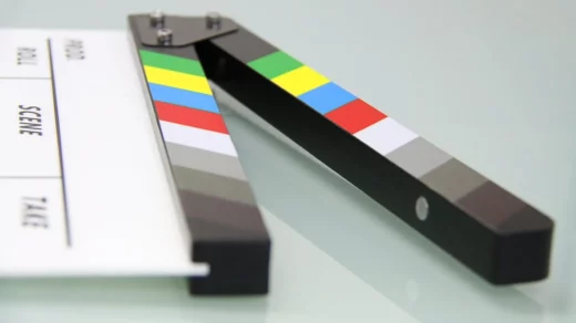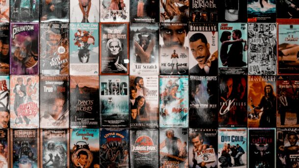
Have you ever wondered about the magic behind those film posters that instantly grab your attention and linger in your memory? Well, you’re in for a treat because today, we’re diving deep into the art of crafting exceptional film posters. So, buckle up as we unravel the secrets that transform a mere promotional tool into a cinematic masterpiece.
Now, you might be thinking, “Why does this matter for a new filmmaker like me?” Well, my friend, the answer lies in the transformative power of film posters. A great film poster makes for great marketing but they’re really about creating an emotional connection, a spark that ignites curiosity and beckons the audience to experience the magic of your creation.
In the following blog, we’ll dissect the anatomy of great film posters, exploring the key elements that make them stand out. From the artful use of imagery and typography to the psychology of colors, we’ll equip you with the tools and knowledge to design film posters that captivate and resonate.
The Anatomy of a Great Film Poster
So, what makes a film poster truly exceptional? It’s all in the details! Let’s break down the key elements that turn a poster from ordinary to extraordinary.
Imagery that Speaks Volumes
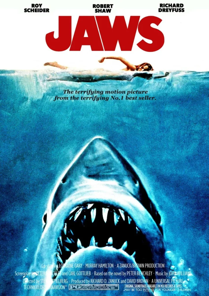
Crafting a visually stunning film poster begins with the art of storytelling through images. Think of your poster as a snapshot of your movie’s essence. Choose visuals that tease the plot, capture the mood, and leave viewers yearning for more. Consider the iconic poster for “Jaws” – a simple yet powerful image that evokes fear and curiosity in equal measure. Your imagery should be a gateway to the world you’ve created on the silver screen.
Typography: More Than Just Words
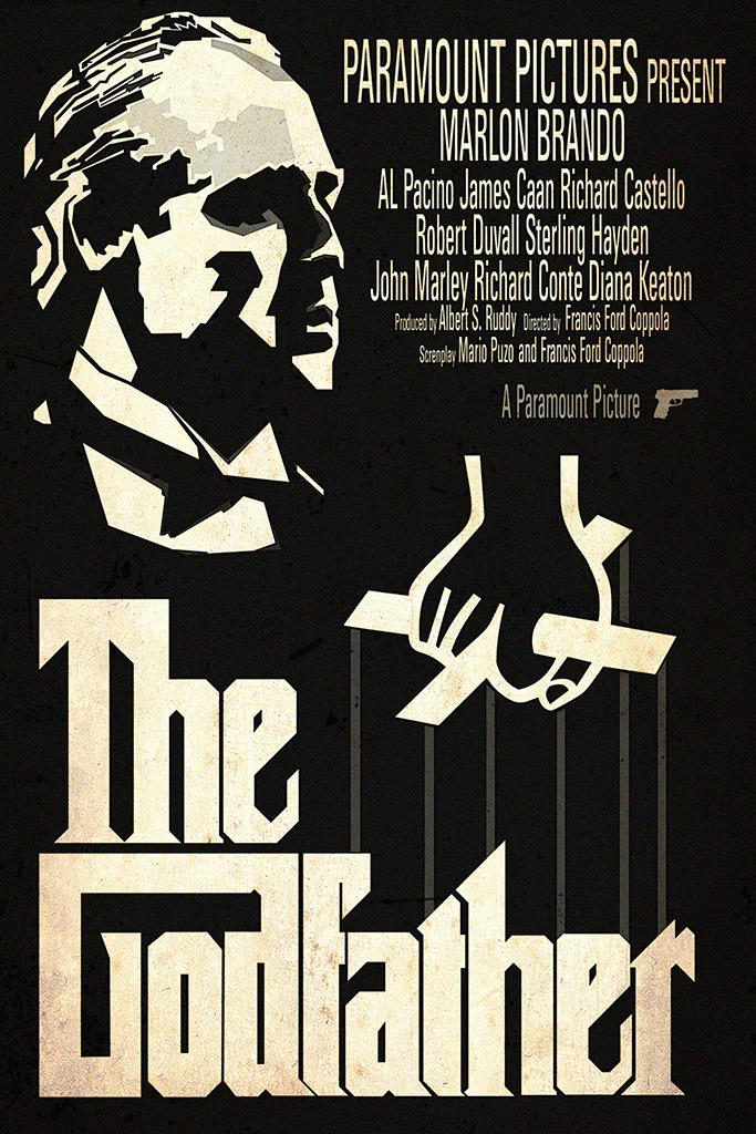
The fonts you choose and how you arrange them can transform your film poster into a work of art. Play with typography to complement the genre and tone of your movie. Take a cue from classics like “The Godfather,” where the bold, serif font exudes sophistication and sets the stage for an epic tale. Experiment with fonts that resonate with your film’s personality and ensure that your title and credits are clear and captivating.
Color Schemes for Impact
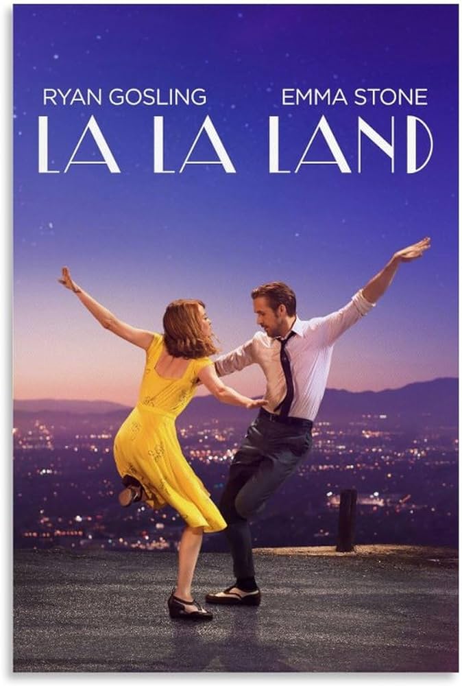
Colors are the unsung heroes of film posters, silently influencing emotions and perceptions. Dive into the psychology of colors and choose a palette that aligns with your film’s mood. Consider the vibrant hues of “La La Land,” reflecting the movie’s whimsical and romantic ambiance. Whether it’s bold and contrasting or subtle and monochromatic, your color scheme should amplify the emotions you want your audience to feel.
Now, let’s connect these dots back to your film posters. In the next section, we’ll explore the emotional depth that can be achieved through your film poster, delving into the art of creating a visual narrative that resonates with your audience.
Tapping into Emotions: Creating a Visual Narrative on Film Posters
Now that we’ve laid the foundation with the essential elements of film posters, it’s time to infuse your creation with the power of feelings.
The Heart of Visual Storytelling
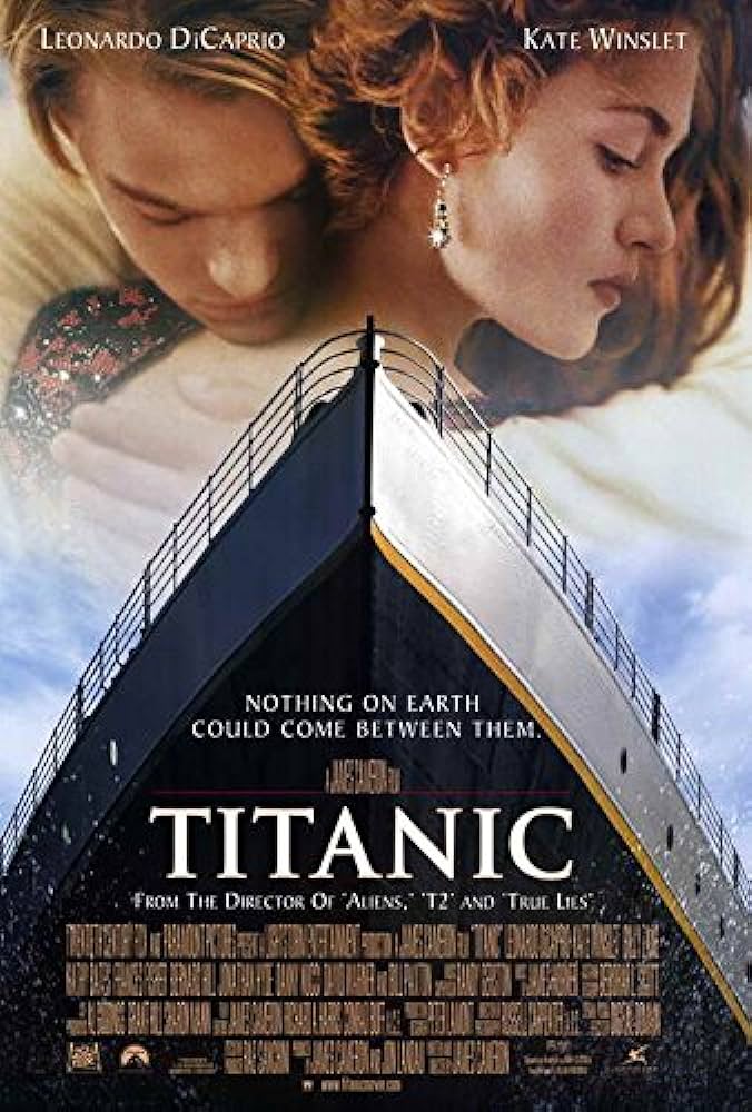
Think of your film poster as a dynamic storyteller who, although static at first glance, whispers emotions to your audience. Think about the narrative arc of your movie and find a way to encapsulate it visually. Consider the poignant poster of “Titanic,” where the intertwined bodies of Jack and Rose against the colossal ship convey love, tragedy, and a journey that transcends time. Your poster should be a teaser that sparks curiosity and stirs the emotional chords of potential viewers.
Evoking Specific Emotions in Posters
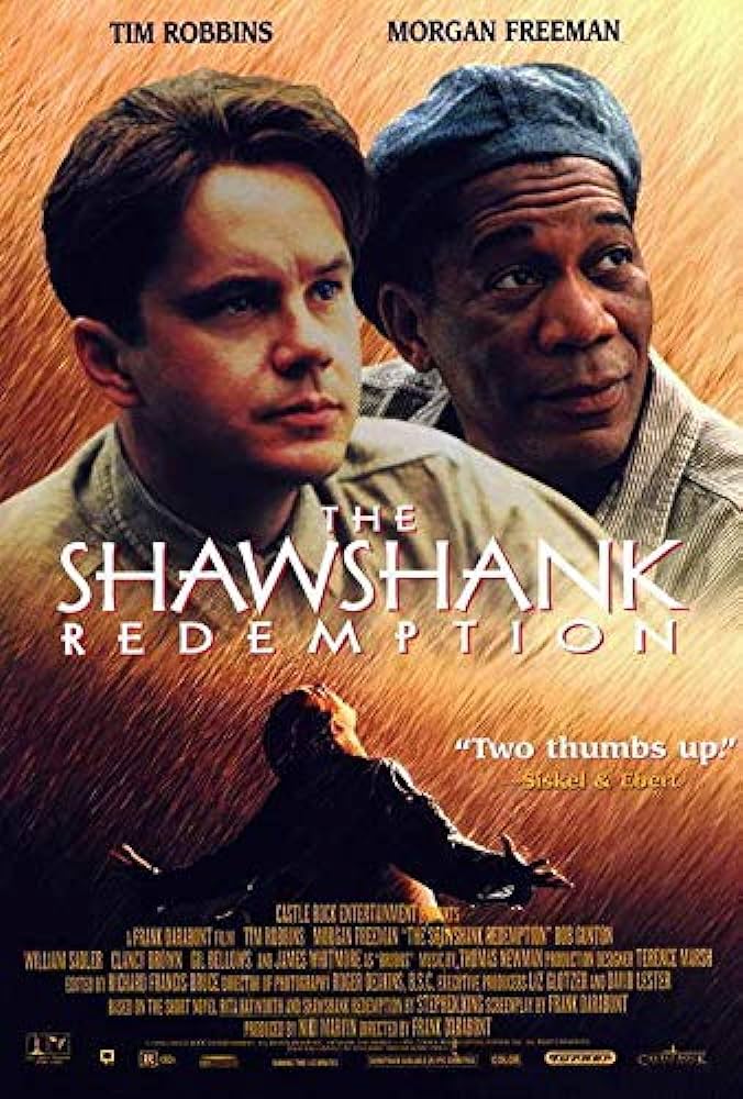
Emotions are the currency of storytelling, and your film poster is the banknote. Dive into the emotional core of your film and identify the primary feelings you want your audience to experience. Whether it’s the tension of a thriller, the warmth of a romantic comedy, or the excitement of an adventure, let your poster radiate those emotions. Look at the poster for “The Shawshank Redemption,” where hope and freedom resonate through the rain-soaked imagery. Craft a visual narrative that invites viewers to feel before they even enter the theater.
Showcasing Emotional Resonance
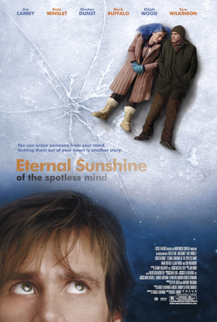
Now, let’s draw inspiration from posters that have successfully tugged at our heartstrings. Take “Eternal Sunshine of the Spotless Mind,” for instance, where the disintegrating image of Jim Carrey and Kate Winslet hints at the fragility of memories and love. Your film poster has the potential to become a work of emotional art – a gateway for the audience to connect with the soul of your story.
As you embark on this journey of infusing emotions into your film posters, remember that each image, color, and font choice is a brushstroke on the canvas of your narrative. In the upcoming sections, we’ll delve into the fine art of typography and the mesmerizing impact of color palettes.
Typography Tricks for Film Posters with Maximum Impact
Typography is the unsung hero of film poster design, wielding the power to captivate, communicate, and elevate your movie to blockbuster status.
Beyond Words: The Typography Game
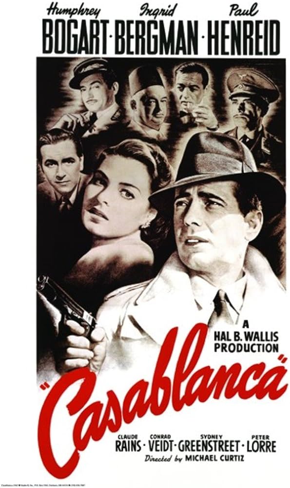
It’s not just about what you say; it’s about how you say it. Your film poster’s typography should be a visual cue, guiding the audience into the essence of your movie. Take a cue from the timeless “Casablanca” poster, where the elegant and classic font mirrors the film’s sophisticated narrative. The right typography sets the stage, hinting at the genre, tone, and era of your cinematic creation.
Choosing Fonts with Character
Fonts are like actors in your movie – each with its own personality and flair. Select fonts that align with the vibe of your film. Are you crafting a thrilling sci-fi epic? Perhaps a futuristic and bold font is your go-to. Designing a whimsical family adventure? Opt for playful and friendly lettering. Your fonts should complement your film’s personality, creating a cohesive visual language that resonates with your audience.
Arranging Text for Impact on Film Posters
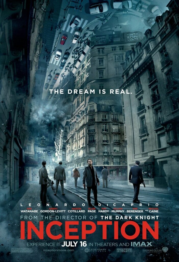
Text placement is your director’s cut in the world of typography. Ensure your film’s title and credits are strategically positioned for maximum impact. Play with hierarchy, size, and spacing to guide the viewer’s eye seamlessly. Look at the mind-bending poster of “Inception,” where the bold, red text against the warped background mirrors the complex narrative of the film. Your typography isn’t just a sidekick – it’s a leading actor in the cinematic symphony of your poster.
As you delve into the typography universe for your film posters, remember that every letter carries a story, and every font choice is a creative decision. In our next section, we’ll explore the kaleidoscopic world of color and how it can transform your film poster into a visual masterpiece.
Color Palette Mastery in Film Posters
Get ready to splash your film poster canvas with a palette of emotions! Colors aren’t just pretty hues; they’re the vibrant threads that weave the visual tapestry of your cinematic masterpiece.
The Psychology of Colors in Film Posters
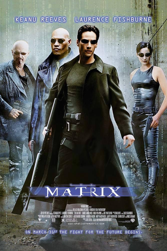
Colors speak a language of their own, and your film poster is the conversation starter. Dive into the psychology of colors and understand how each shade influences emotions and perceptions. Just like “The Matrix” uses a blue-tinted palette to evoke a sense of technological wonder and dystopia, your color choices should amplify the mood and atmosphere of your film. It’s time to paint your poster with intention and emotion.
Aligning Colors with Film Mood
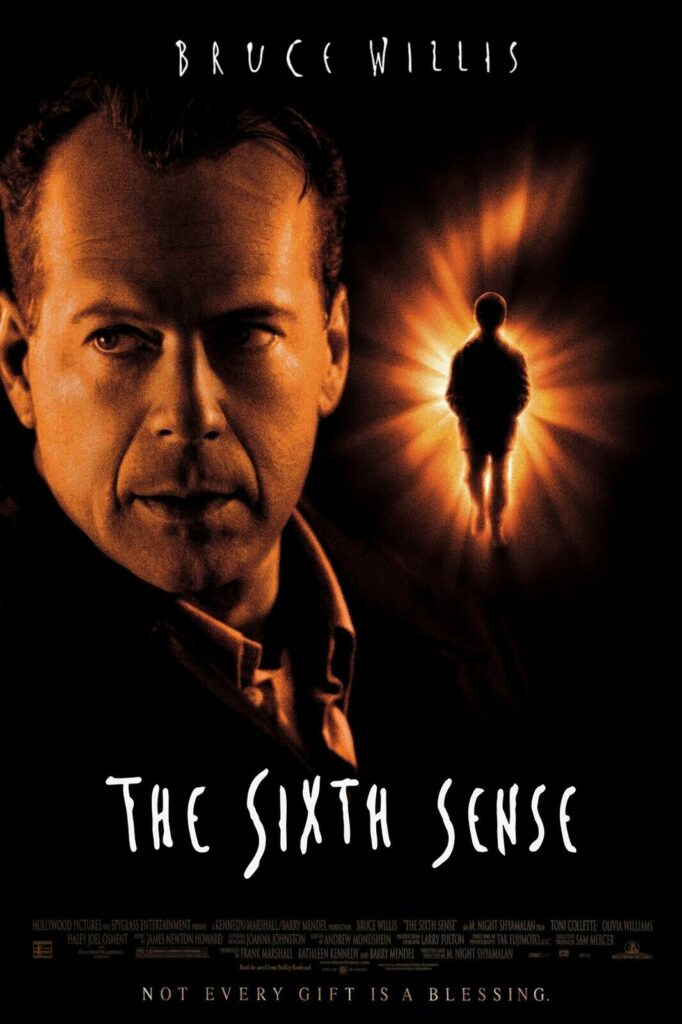
Your film has a mood, a vibe, a unique atmosphere. Let your color palette be its visual echo. If you’re crafting a film full of romance and nostalgia like the aforementioned “La La Land,” consider blue hues and dreamy hues. For a suspenseful thriller like “The Sixth Sense,” delve into the enigmatic world of warm yet muted tones. Aligning your color choices with your film’s mood creates a seamless connection between the poster and the story it tells.
Example of Colorful Impact from Film Posters
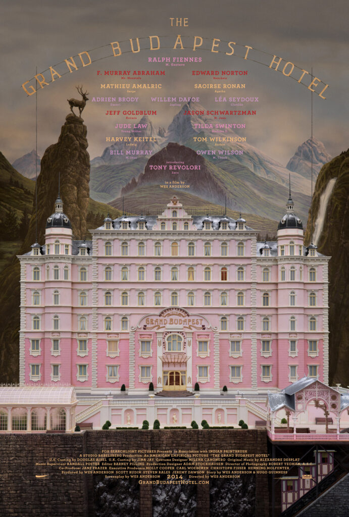
Let’s draw inspiration from the vibrant canvases of iconic film posters. “The Grand Budapest Hotel” is a symphony of pastel colors that mirrors the film’s whimsical and eccentric charm. Your color palette should be more than a visual feast as well as a strategic tool that enhances the overall impact of your poster. So, pick your colors like a director selects the perfect lighting – with purpose and vision.
In Conclusion
We’ve delved into the essential elements – imagery, typography, and color schemes – that constitute the DNA of a great film poster. From the captivating simplicity of “Jaws” to the typographic elegance of “Casablanca” and the vibrant palette of “Titanic,” each example showcased the power of visual storytelling in the world of cinema.
In the world of film, every frame tells a story, and film posters are the prologues. Embrace the art, experiment with creativity, and let your posters resonate with the passion you pour into your films. Lights may dim, but the impact of a remarkable film poster can endure. Here’s to your cinematic brilliance, and may your film posters be the stars that guide audiences to your stories!
Looking to get an influx of funding for your short film? Look no further. The Film Fund is looking to be a part of the creation of future short films through our film funding contest. By sending us a one-sentence synopsis of your film as well as what you plan to use our funding for, you could win up to $10,000 in funding for your short narrative or short documentary! Head to our contest sign-up page to learn more and enter now.